Porfolio of Website Designs
Kilkenny Science Festival
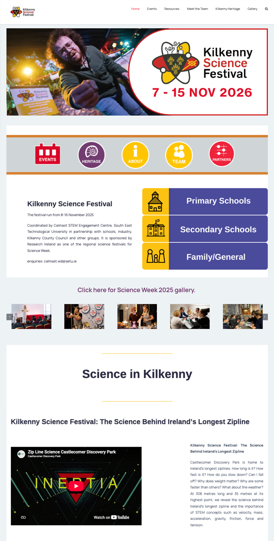
Part of the CALMAST STEM Engagement Centre, Kilkenny Science Festival is one of Science Week’s regional festivals for Kilkenny.
This is the second website that I’ve worked on to update the look and feel to not only be more user friendly, but to optimize the back end and keep the website running smoothly without being overloaded. First, the design was made in Figma. This included coming up with font styles and a colour scheme, which I then created brand guidelines for.
Previously, the STEM KK website had gotten very slow and was hard to work on. The first part of this update was to optimize the website with updates and deleting hidden files from the C-Panel. After that work was done, I created a staging site to work on the design.
For this website, I was moving from Avada over to Elementor using the Astra theme. Elementor is more user-friendly and capable of building better layouts and customized designs of the website, and I prefer building in Elementor. As the team has people that aren’t as familiar with website design, it is also important to have a builder that is beginner-friendly for design.
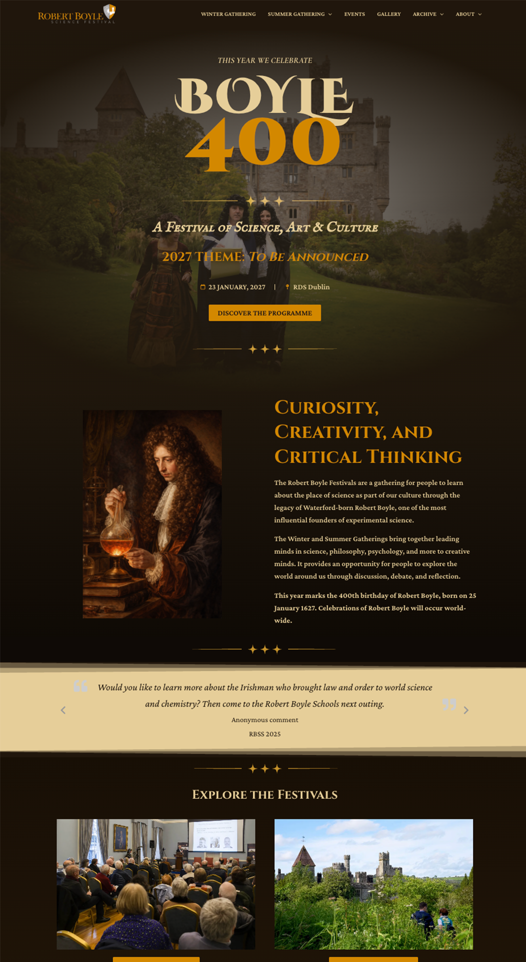
The goal of this design was to highlight the main parts of Kilkenny Science Festival. The events, different programmes for schools, and the heritage of Kilkenny. That was the focus of building the homepage, so users can easily see what there is, but also be drawn to the design and showing images of the festival to get intrique.
Another step in building was to parse through all of the old pages and content, and determine was was necessary, note what was out-of-date, and organize for best user experience.
The final website ended up being smaller, easier to navigate, highlighting the important parts of Kilkenny Science Festival, and sticking within the design of colors and font. While moving to Elementor involves rebuilding the whole website, it was worthwhile in the end to see the final result, which turned out to look exactly like the Figma mockup.
Robert Boyle Website
Part of the CALMAST STEM Engagement Centre, the Robert Boyle Festivals offer a place for curious minds to gather for discussion and thought around the place of science in our culture.
Prior to myself joining, Calmast didn’t have a team-member with the knowledge of capabilities to think of website design with a “User First” mentality. 2027 marked an important year for the Robert Boyle Festivals, as Boyle 400, and events and celebrations will take place worldwide.
With the knowledge that the Boyle 400 would drive more traffic to the website, of leading speakers and minds throughout the world, I thought it was very important to present ourselves in the best way possible through the website.
I took it upon myself to create a mockup. In this design, I thought about what the Robert Boyle Festivals are really trying to achieve. It’s a place of sophistication, intrique, curiosity, and also needs to entice people to want to attend the festival.
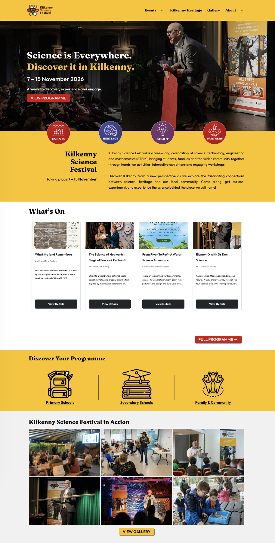
From this, I created a design that is sleek, sophisticated, and also inviting. Using a color pallette derived from the Robert Boyle logo, I wanted to give the branding a mysterious but also calming effect. The dark theme worked best with my goals on the website, using star accents to give them sense of “philosophy”.
Part of this process was to also make sure the website was UX/UI friendly. If someone visits the website, they can see at a glance what the festivals are. They can see at a glance what we want them to do – look at the programme. And it’s easy to navigate to the different parts.
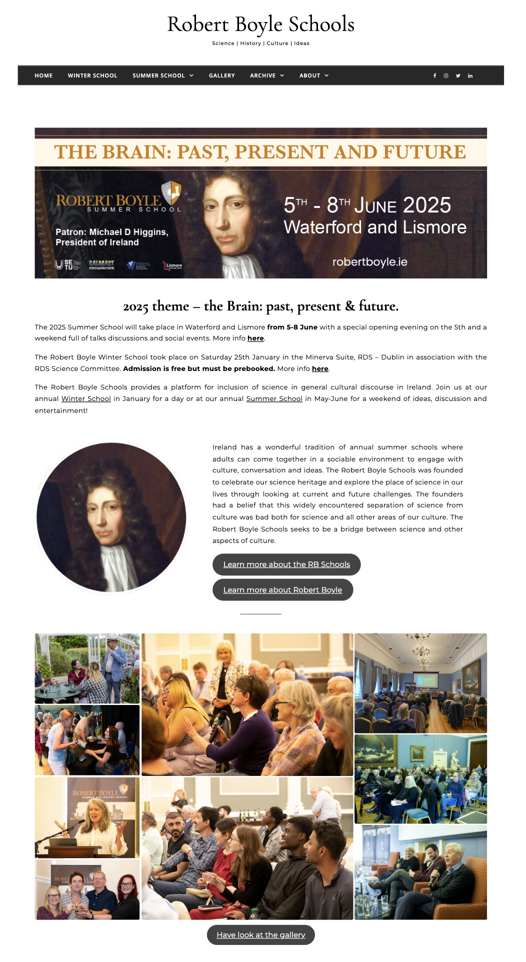
The previous website was filled with text, large paragraphs, and clunky designs that feel scrapped together. It didn’t invite you to spend time on the website and look into more information. The archive page on the updated design gives a quick, at a glance look to past programmes without requiring visitors to go to another page with every programme they want to look through.
On the right you can see the before and after of the website design. Overall, I’m very happy with the updated look and feel, and think that it presents the Festivals in the best way.